Component Guide
Homepage widgets are built using React components. These components are responsible for fetching data from the API and rendering the widget UI. Homepage provides a set of hooks and utilities to help you build your widget component.
A Basic Widget Component
Here is an example of a basic widget component:
import { useTranslation } from "next-i18next";

import Container from "components/services/widget/container";
import Block from "components/services/widget/block";
import useWidgetAPI from "utils/proxy/use-widget-api";

export default function Component({ service }) {
  const { t } = useTranslation();
  const { widget } = service;
  const { data, error } = useWidgetAPI(widget, "info");

  if (error) {
    return <Container service={service} error={error} />;
  }

  if (!data) {
    return (
      <Container service={service}>
        <Block label="yourwidget.key1" />
        <Block label="yourwidget.key2" />
        <Block label="yourwidget.key3" />
      </Container>
    );
  }

  return (
    <Container service={service}>
      <Block label="yourwidget.key1" value={t("common.number", { value: data.key1 })} />
      <Block label="yourwidget.key2" value={t("common.number", { value: data.key2 })} />
      <Block label="yourwidget.key3" value={t("common.number", { value: data.key3 })} />
    </Container>
  );
}
Breakdown
We'll cover two sections of the widget component: hooks and components.
Hooks
useTranslation
This hook is used to translate text and numerical content in widgets. Homepage provides a set of helpers to help you localize your widgets. You can learn more about translations in the Translations Guide.
useWidgetAPI
This hook is used to fetch data from the API. We cover this hook in more detail in the API Guide.
Components
Homepage provides a set of components to help you build your widget UI. These components are designed to provide a consistent layout, and all widgets are expected to use these components.
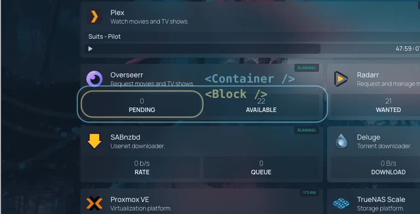
<Container>
This component is a wrapper for the widget. It provides a consistent layout for all widgets.
service is a prop that is passed to the widget component. It contains information about the service that the widget is displaying.
If there is an error fetching data from the API, the error prop can be passed to the Container component.
<Block>
This component is used to display a key-value pair. It takes a label and value as props.
The label prop is used to look up the translation key in the translation files. The value prop is used to display the value of the block. To learn more about translations, please refer to the Translations Guide.
If there is no data available, the Block component can be used to display a placeholder layout.