Settings
The settings.yaml file allows you to define application level options. For changes made to this file to take effect, you will need to regenerate the static HTML, this can be done by clicking the refresh icon in the bottom right of the page.
Title
You can customize the title of the page if you'd like.
Start URL
You can customize the start_url as required for installable apps. The default is "/".
Background Image
Heads Up!
You will need to restart the container any time you add new images, this is a limitation of the Next.js static site server.
Heads Up!
Do not create a bind mount to the entire /app/public/ directory.
If you'd like to use a background image instead of the solid theme color, you may provide a full URL to an image of your choice.
background: https://images.unsplash.com/photo-1502790671504-542ad42d5189?auto=format&fit=crop&w=2560&q=80
Or you may pass the path to a local image relative to e.g. /app/public/images directory.
For example, inside of your Docker Compose file, mount a path to where your images are kept:
and then reference that image:
Background Opacity & Filters
You can specify filters to apply over your background image for blur, saturation and brightness as well as opacity to blend with the background color. The first three filter settings use tailwind CSS classes, see notes below regarding the options for each. You do not need to specify all options.
background:
  image: /images/background.png
  blur: sm # sm, "", md, xl... see https://tailwindcss.com/docs/backdrop-blur
  saturate: 50 # 0, 50, 100... see https://tailwindcss.com/docs/backdrop-saturate
  brightness: 50 # 0, 50, 75... see https://tailwindcss.com/docs/backdrop-brightness
  opacity: 50 # 0-100
Card Background Blur
You can apply a blur filter to the service & bookmark cards. Note this option is incompatible with the background blur, saturate and brightness filters.
Favicon
If you'd like to use a custom favicon instead of the included one, you may provide a full URL to an image of your choice.
Or you may pass the path to a local image relative to the /app/public directory. See Background Image for more detailed information on how to provide your own files.
Theme
You can configure a fixed theme (and disable the theme switcher) by passing the theme option, like so:
Color Palette
You can configured a fixed color palette (and disable the palette switcher) by passing the color option, like so:
Supported colors are: slate, gray, zinc, neutral, stone, amber, yellow, lime, green, emerald, teal, cyan, sky, blue, indigo, violet, purple, fuchsia, pink, rose, red, white
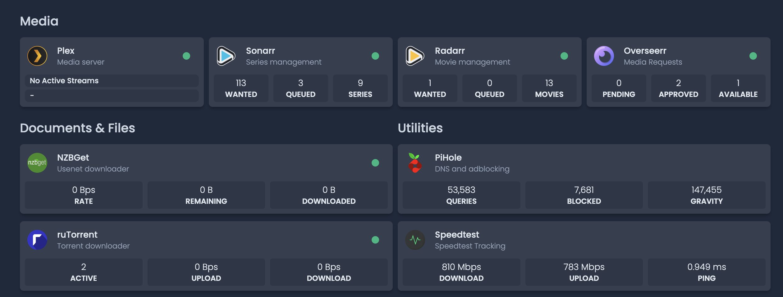
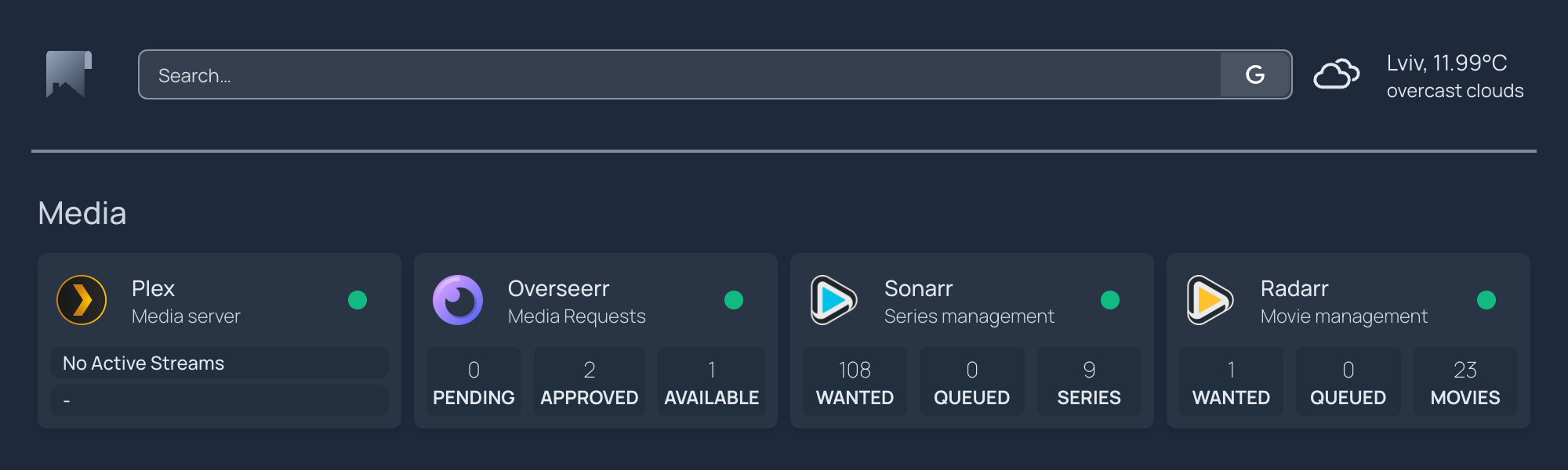
Layout
You can configure service and bookmarks sections to be either "column" or "row" based layouts, like so:
Assuming you have a group named Media in your services.yaml or bookmarks.yaml file,
As an example, this would produce the following layout:
Sorting
Service groups and bookmark groups can be mixed in order, but should use different group names. If you do not specify any bookmark groups they will all show at the bottom of the page.
Using the same name for a service and bookmark group can cause unexpected behavior like a bookmark group being hidden
Groups will sort based on the order in the layout block. You can also mix in groups defined by docker labels, e.g.
layout:
  - Auto-Discovered1:
  - Configured1:
  - Configured2:
  - Auto-Discovered2:
  - Configured3:
      style: row
      columns: 3
Headers
You can hide headers for each section in the layout as well by passing header as false, like so:
Category Icons
You can also add an icon to a category under the layout setting similar to the options for service icons, e.g.
  Home Management & Info:
    icon: home-assistant.png
  Server Tools:
    icon: https://cdn-icons-png.flaticon.com/512/252/252035.png
  ...
Icon Style
The default style for icons (e.g. icon: mdi-XXXX) is a gradient, or you can specify that prefixed icons match your theme with a 'flat' style using the setting below.
More information about prefixed icons can be found in options for service icons.
Tabs
Version 0.6.30 introduced a tabbed view to layouts which can be optionally specified in the layout. Tabs is only active if you set the tab field on at least one layout group.
Tabs are sorted based on the order in the layout block. If a group has no tab specified (and tabs are set on other groups), services and bookmarks will be shown on all tabs.
Every tab can be accessed directly by visiting Homepage URL with #Group (name lowercase and URI-encoded) at the end of the URL.
For example, the following would create four tabs:
layout:
  ...
  Bookmark Group on First Tab:
    tab: First

  First Service Group:
    tab: First
    style: row
    columns: 4

  Second Service Group:
    tab: Second
    columns: 4

  Third Service Group:
    tab: Third
    style: row

  Bookmark Group on Fourth Tab:
    tab: Fourth

  Service Group on every Tab:
    style: row
    columns: 4
Five Columns
You can add a fifth column to services (when style: columns which is default) by adding:
By default homepage will max out at 4 columns for services with columns style
Collapsible sections
You can disable the collapsible feature of services & bookmarks by adding:
By default the feature is enabled.
Initially collapsed sections
You can initially collapse sections by adding the initiallyCollapsed option to the layout group.
This can also be set globaly using the groupsInitiallyCollapsed option.
The value set on a group will overwrite the global setting.
By default the feature is disabled.
Use Equal Height Cards
You can enable equal height cards for groups of services, this will make all cards in a row the same height.
Global setting in settings.yaml:
Per layout group in settings.yaml:
By default the feature is disabled
Header Style
There are currently 4 options for header styles, you can see each one below.

Base URL
In some proxy configurations, it may be necessary to set the documents base URL. You can do this by providing a base value, like so:
The URL must be a full, absolute URL, or it will be ignored by the browser.
Language
Set your desired language using:
Currently supported languages: ca, de, en, es, fr, he, hr, hu, it, nb-NO, nl, pt, ru, sv, vi, zh-CN, zh-Hant
You can also specify locales e.g. for the DateTime widget, e.g. en-AU, en-GB, etc.
Link Target
Changes the behaviour of links on the homepage,
Use _blank to open links in a new tab, _self to open links in the same tab, and _top to open links in a new window.
This can also be set for individual services. Note setting this at the service level overrides any setting in settings.json, e.g.:
Providers
The providers section allows you to define shared API provider options and secrets. Currently this allows you to define your weather API keys in secret and is also the location of the Longhorn URL and credentials.
providers:
  openweathermap: openweathermapapikey
  weatherapi: weatherapiapikey
  longhorn:
    url: https://longhorn.example.com
    username: admin
    password: LonghornPassword
You can then pass provider instead of apiKey in your widget configuration.
Quick Launch
You can use the 'Quick Launch' feature to search services, perform a web search or open a URL. To use Quick Launch, just start typing while on your homepage (as long as the search widget doesn't have focus).
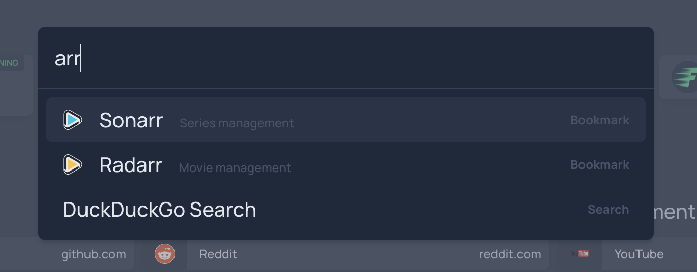
There are a few optional settings for the Quick Launch feature:
searchDescriptions: which lets you control whether item descriptions are included in searches. This is false by default. When enabled, results that match the item name will be placed above those that only match the description.hideInternetSearch: disable automatically including the currently-selected web search (e.g. from the widget) as a Quick Launch option. This is false by default, enabling the feature.showSearchSuggestions: show search suggestions for the internet search. If this is not specified then the setting will be inherited from the search widget. If it is not specified there either, it will default to false. For custom providers thesuggestionUrlneeds to be set in order for this to work.provider: search engine provider. If none is specified it will try to use the provider set for the Search Widget, if neither are present then internet search will be disabled.hideVisitURL: disable detecting and offering an option to open URLs. This is false by default, enabling the feature.
quicklaunch:
  searchDescriptions: true
  hideInternetSearch: true
  showSearchSuggestions: true
  hideVisitURL: true
  provider: google # google, duckduckgo, bing, baidu, brave or custom
or for a custom search:
quicklaunch:
  provider: custom
  url: https://www.ecosia.org/search?q=
  target: _blank
  suggestionUrl: https://ac.ecosia.org/autocomplete?type=list&q=
Homepage Version
By default the release version is displayed at the bottom of the page. To hide this, use the hideVersion setting, like so:
Log Path
By default the homepage logfile is written to the a logs subdirectory of the config folder. In order to customize this path, you can set the logpath setting. A logs folder will be created in that location where the logfile will be written.
By default, logs are sent both to stdout and to a file at the path specified. This can be changed by setting the LOG_TARGETS environment variable to one of both (default), stdout or file.
Show Docker Stats
You can show all docker stats expanded in settings.yaml:
or per-service (services.yaml) with:
If you have both set the per-service settings take precedence.
Status Style
You can choose from the following styles for docker or k8s status, site monitor and ping: dot or basic
- The default is no value, and displays the monitor and ping response time in ms and the docker / k8s container status
dotshows a green dot for a successful monitor ping or healthy status.basicshows either UP or DOWN for monitor & ping
For example:
or per-service (services.yaml) with:
If you have both set, the per-service settings take precedence.
Instance Name
Name used by automatic docker service discovery to differentiate between multiple homepage instances.
For example:
Hide Widget Error Messages
Hide the visible API error messages either globally in settings.yaml:
or per service widget (services.yaml) with:
If either value is set to true, the error message will be hidden.